GOAT NETWORK
Branding & Website
Rebranding a Bitcoin Infrastructure Platform.

GOAT NETWORK REBRANDING
A new identity for a new era of digital infrastructure.
[Overview]
GOAT Network evolved beyond its original Bitcoin Layer 2 positioning toward a broader infrastructure platform for the digital economy. I helped translate this shift into a refreshed brand identity and digital experience, clarifying its technology, unifying its ecosystem, and building a scalable foundation for future products.
[Highlights]
Evolved the brand around a new business direction
Translated GOAT’s shift from a Bitcoin-focused product into a broader infrastructure narrative, while preserving recognition from the existing brand.
Turned a complex ecosystem into a clear digital experience
Reorganized product, technology, builder, and content narratives into a connected website experience that makes complex infrastructure easier to understand.
[Timeline]
Jan 2026 - May 2026
[Industry]
Blockchain / AI Infrastructure
[Platforms]
Desktop, Mobile
[My Role]
Brand Designer
[Team]
2 Designers
1 Project Manager

Brand Evolution
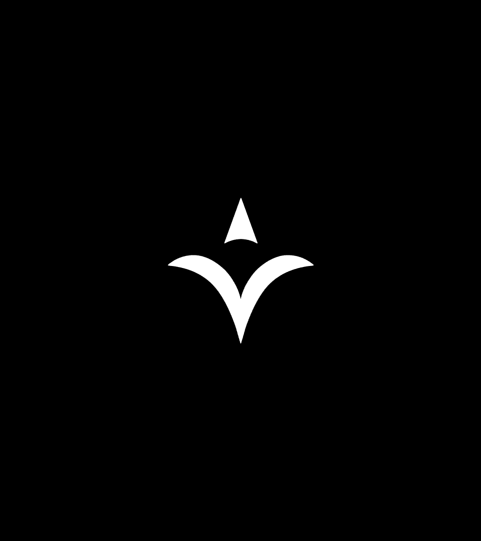
In Sumerian and Akkadian traditions, star symbols represented divinity, celestial order, and direction, while goats signified endurance and the foundations of civilization. The logo unites these forms through an abstract goat and a singular star or triangular mark, expressing orientation, resilience, and cosmic balance. The symbol also can be read as a simplified system diagram. A single node is positioned above a distributed form, indicating a reference signal rather than a command center.
Roboto Mono is chosen for its monospaced structure and rational geometry. Each character occupies equal horizontal space, reinforcing a sense of precision, neutrality, and system logic. This typographic choice complements the logo’s geometric construction and proportional framework, creating a consistent visual language rooted in clarity and order.
png
Svg

png
Svg

png
Svg
png
Svg
The logo construction follows a proportional system informed by the golden ratio, guiding the relative scale between primary curves and negative space to achieve visual harmony.

Visual Identity
GOAT’s new visual identity reflects its evolution from a Bitcoin Layer 2 into infrastructure for the agentic economy, bringing together Bitcoin’s trust-minimized foundation and AI agents as emerging economic participants. Grids, nodes, radial lines, and system diagrams create an infrastructural yet forward-looking visual language, representing the interconnected networks of payments, settlement, identity, and trust that power GOAT’s ecosystem.



Typography & Color
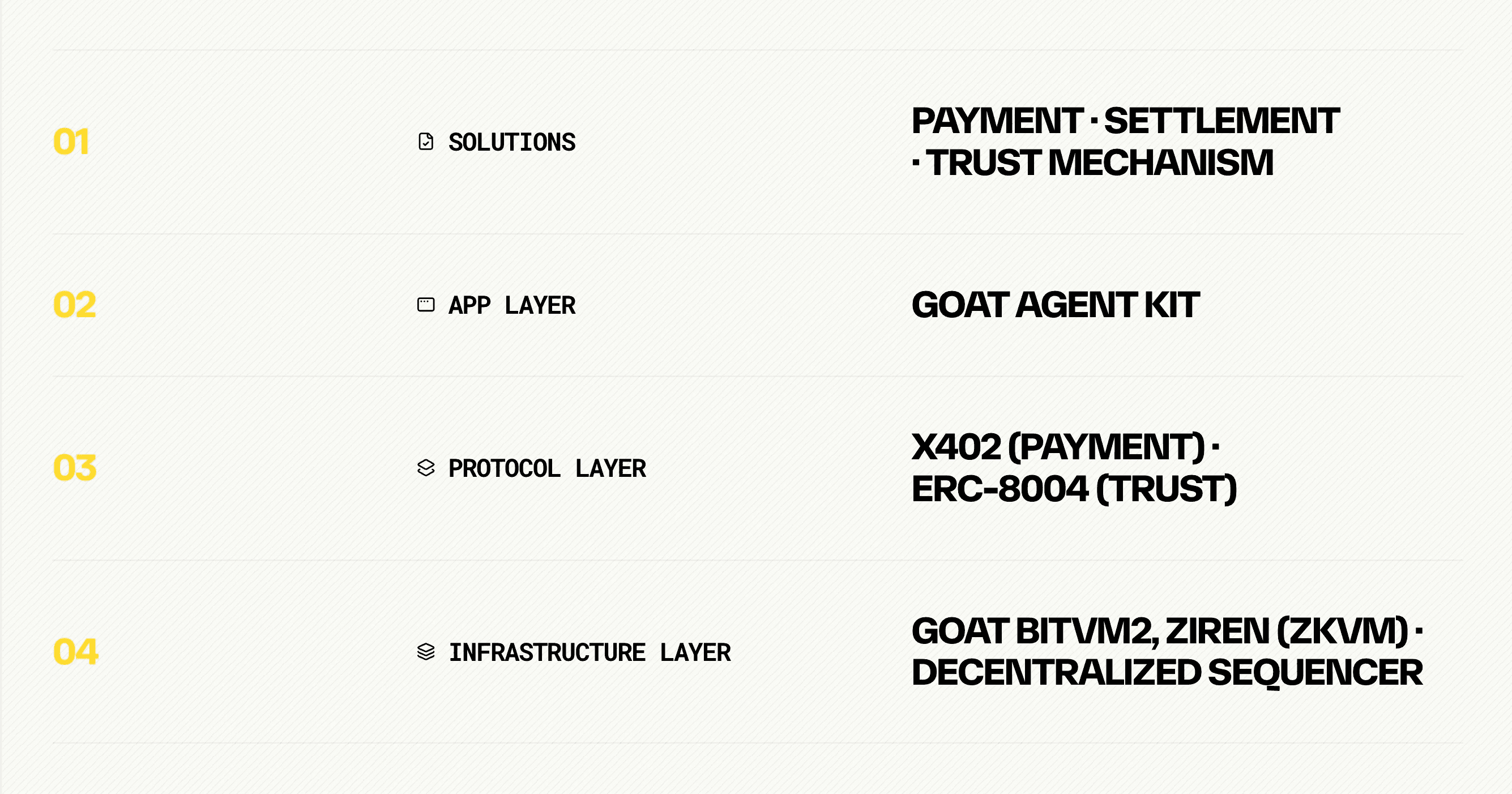
Typography was designed around contrast between technical precision and editorial storytelling. The palette is intentionally restrained. Black and white establish the core system, reflecting the permanence and neutrality associated with Bitcoin infrastructure, while yellow is used selectively to signal key information, navigation, and moments of emphasis rather than functioning as a decorative brand color.
Payment
Settlement
trust mechanism



Graphic Language
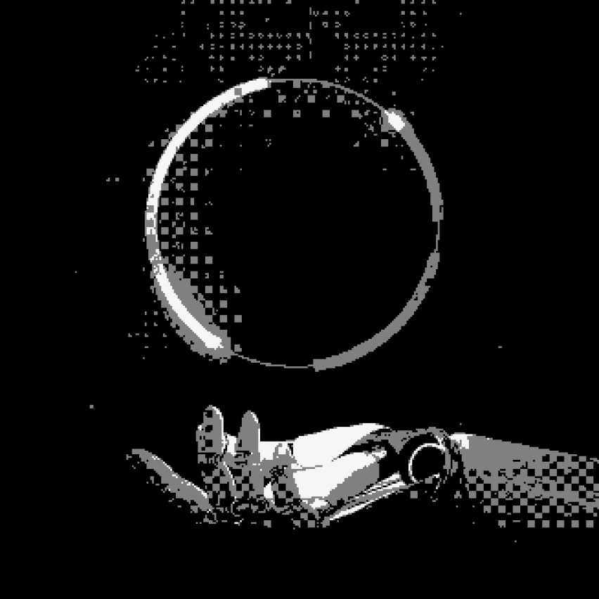
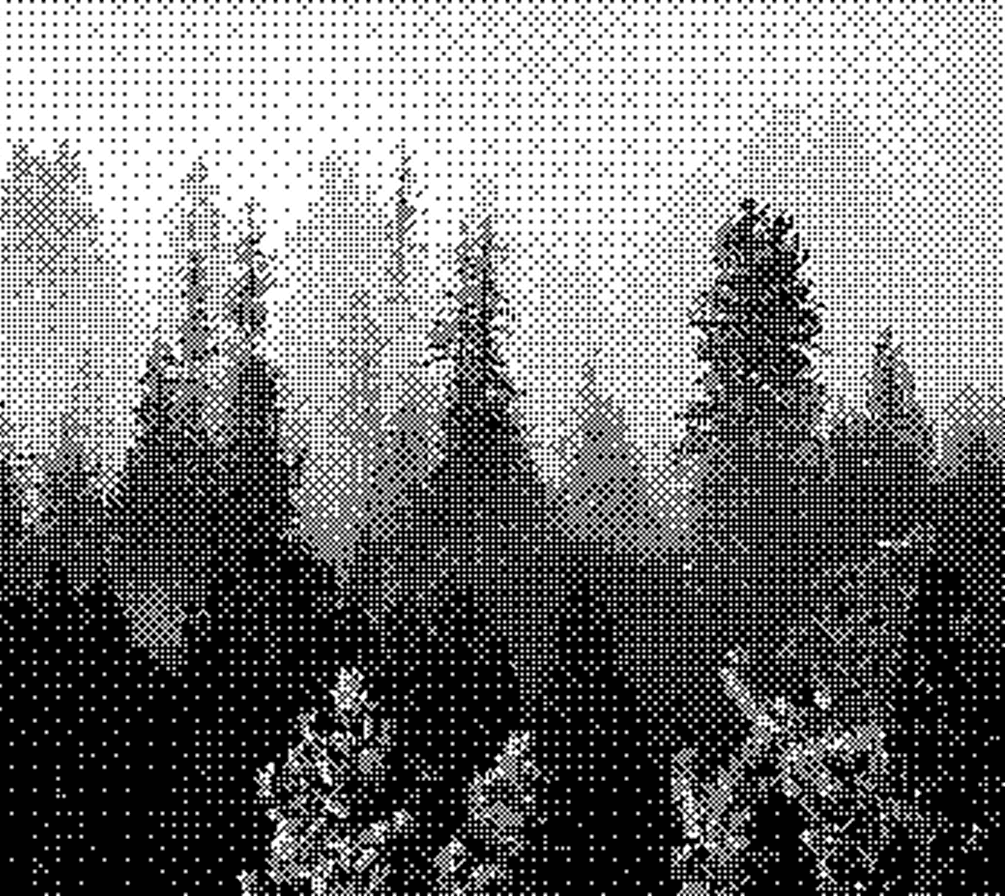
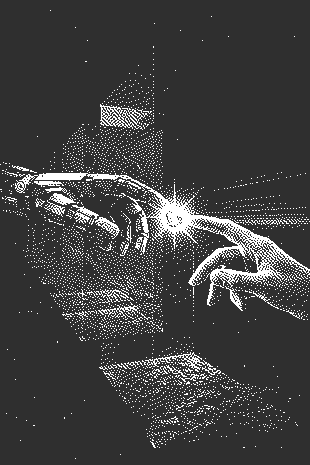
Rather than relying on conventional crypto imagery, the system uses cosmic, scientific, and human–machine imagery to represent exploration and the emergence of autonomous agents. Radial compositions and directional lines visually reinforce the idea of many participants operating through a shared infrastructure. Photography and illustrations are converted into a consistent monochrome halftone treatment, giving imagery a computational, machine-rendered quality while connecting it to the black-and-white identity system.