[POIZON]
POIZON App - Gift Card
E-Commerce
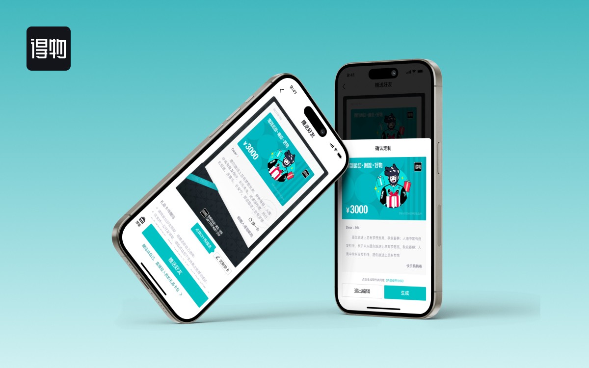
POIZON App - Gift Card
Feature Design for Existing Mobile App
[Overview]
This is an internship project at POIZON Shanghai. POIZON, China's largest sneaker trading platform, is a fashion marketplace featuring shoes, clothing, and luxury items. In 2019, it had a $10 billion annual GMV and over 1.4 million monthly active users. This project focuses on boosting sales by adding a personalized messaging feature to meet users' demand for customization and support business growth.
[Highlights]
Cross-functional collaboration and get stakeholders buy-ins:
Collaborated with the team to uphold industry standards and regulatory compliance.
Initiate design reviews and workshops with cross functional team to share design updates and get feedback.
Maintain clear design documentation:
Maintained clear and organized design documentation throughout the project lifecycle.
[Timeline]
Two Weeks
[Industry]
E-Commerce
[Platforms]
Mobile
[My Role]
UI/UX Designer
[Team]
4 Engineers
1 Lead Designer
1 UI/UX Designer
1 Product Manager
Problem
The current volume of gift card purchases and senders is not satisfying. The limited selection of pre-written notes fails to meet users' desire for personalization.
Competitors
A lot of companies, such as Starbucks, KFC, HEYTEA, etc, provide gift card customization.
Some companies allow users to customize the entire gift card, including the card itself and the personal notes.
Key user flow
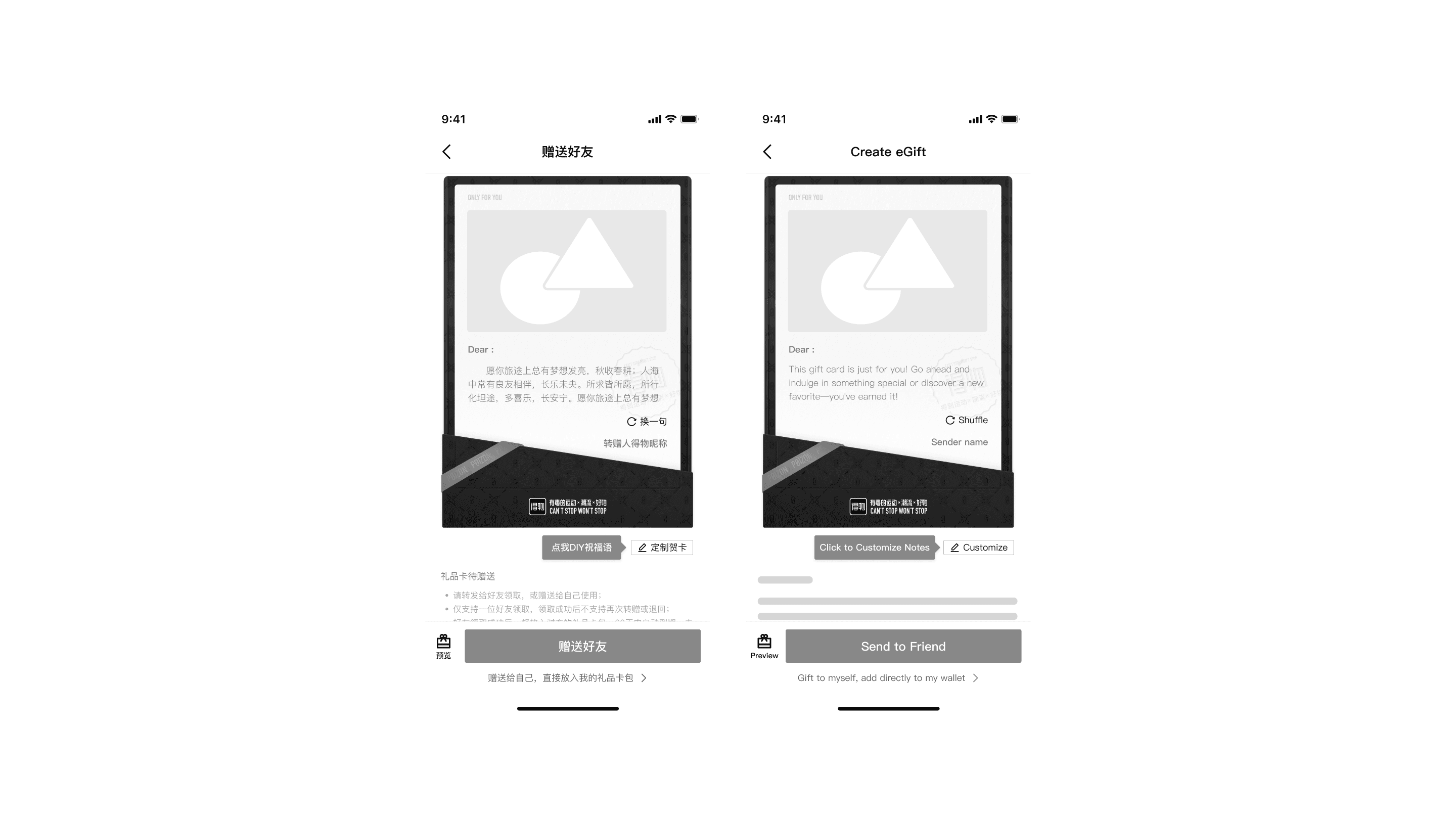
Giftcard Preview Page
Giftcard Preview Page
It contains the entry point of the feature.
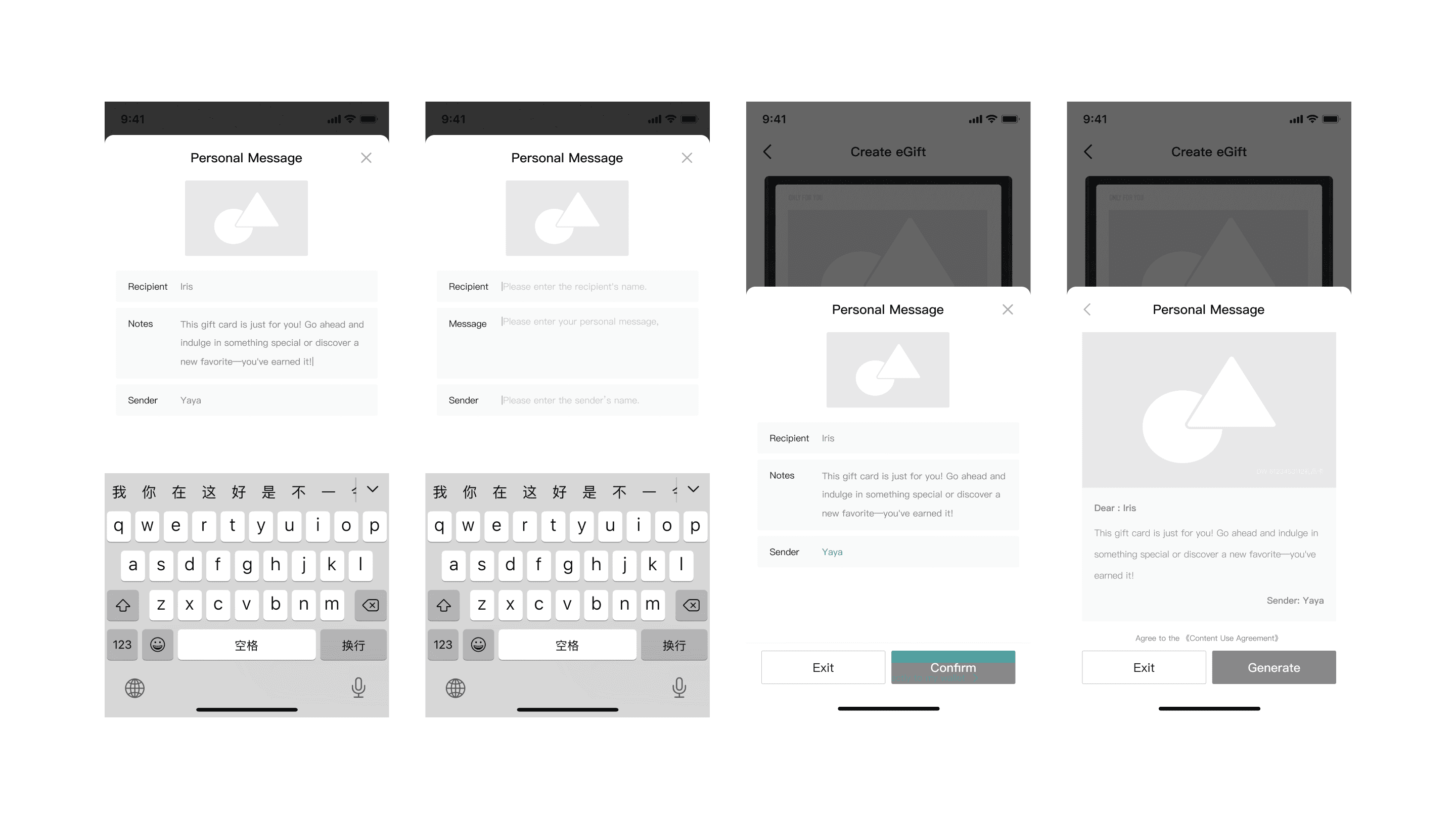
Notes Customization
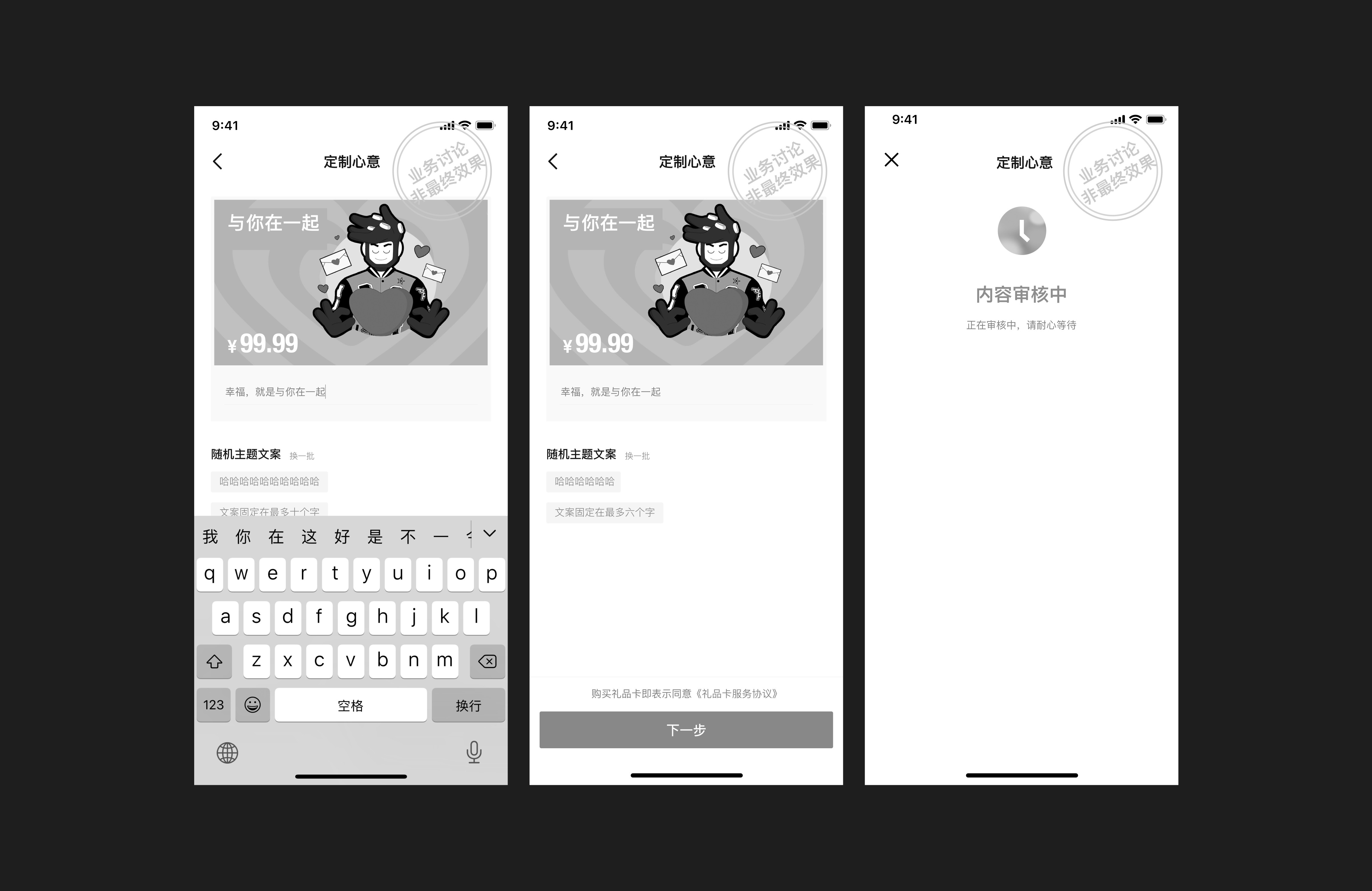
The popover includes three fields: recipient name, personal notes, sender name, and a thumbnail preview of the gift card.
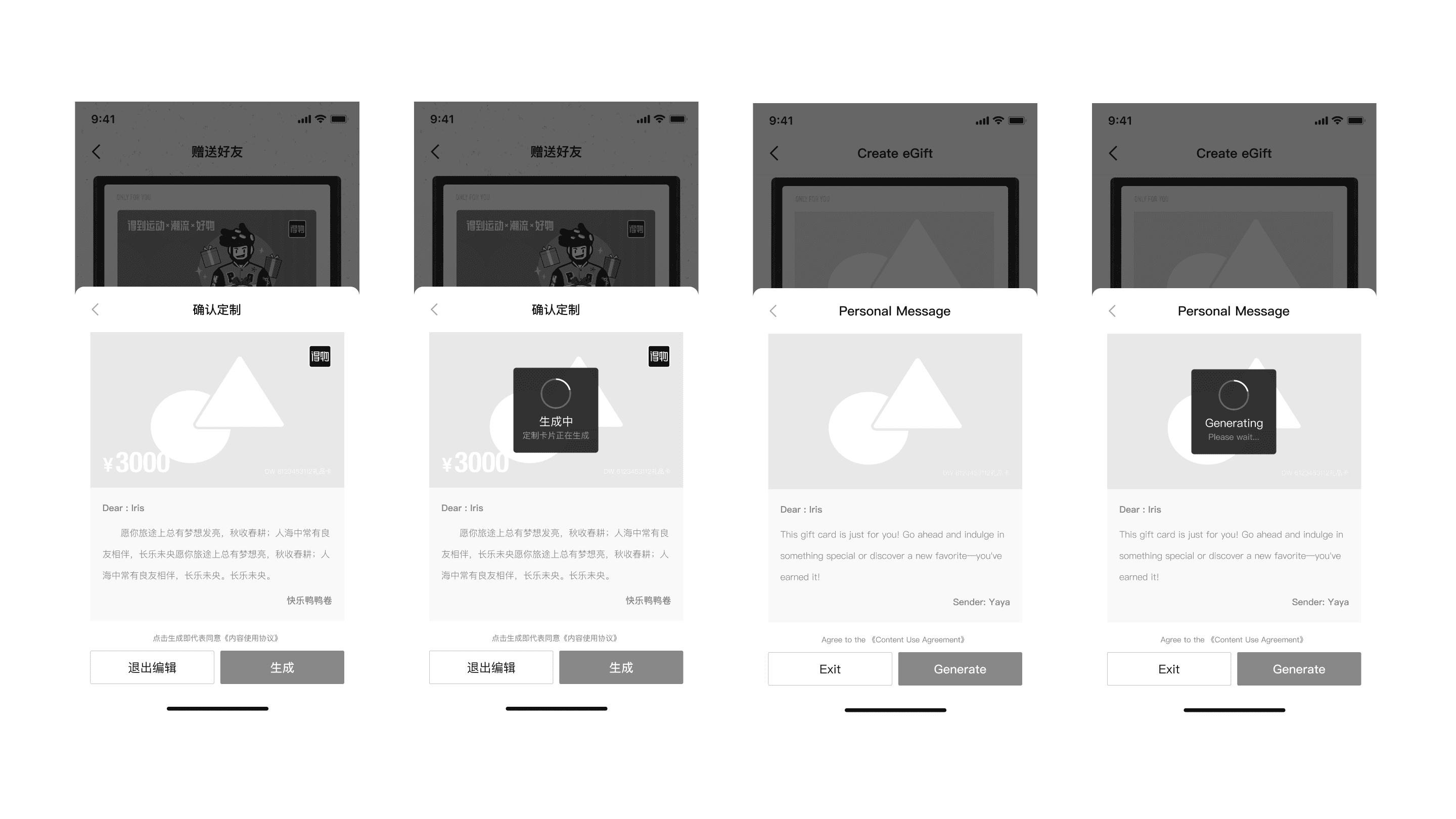
3. Submit for content moderation
To ensure the user’s written content doesn’t include sensitive information or prohibited words, users need to go through an auditing process, in which they need to wait around 5 seconds to receive the results before sending out the gift card.
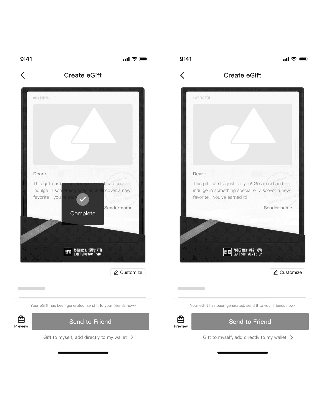
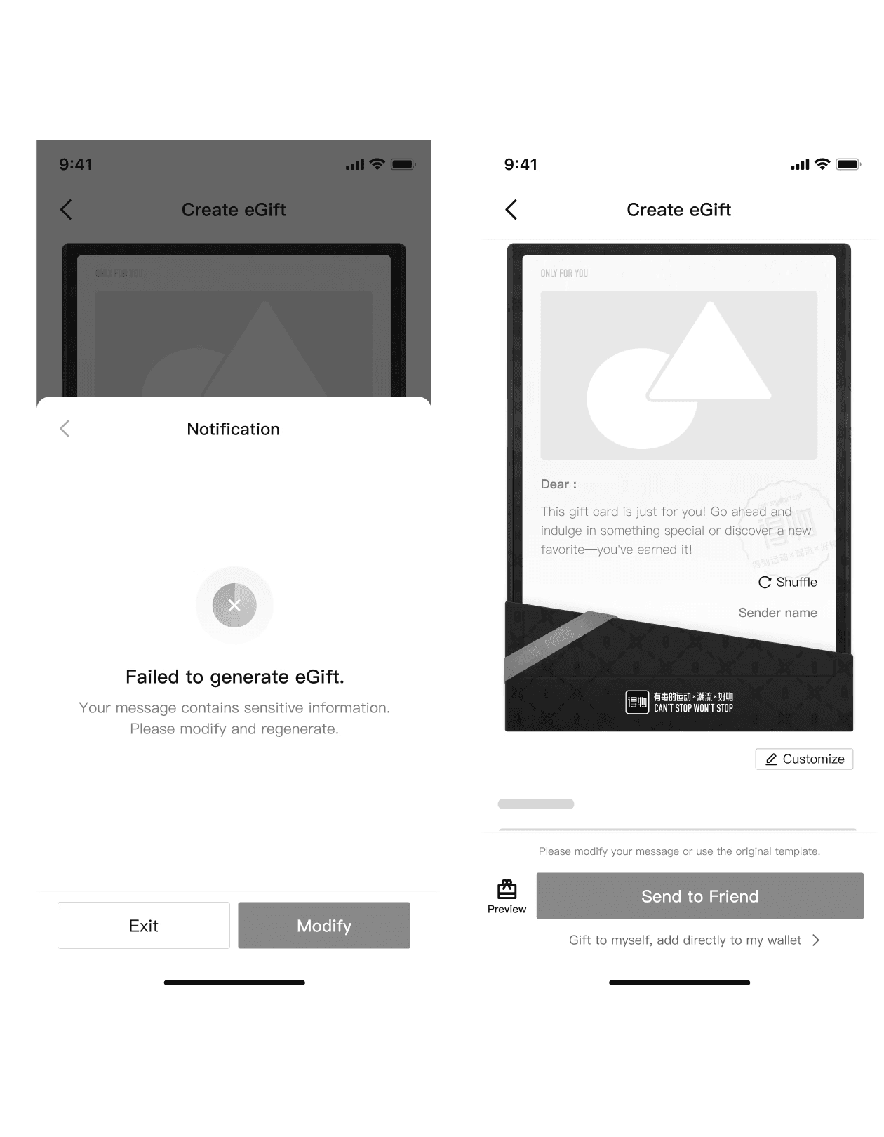
4. Moderation passed / Moderation failed
If it passes, the user can send out the gift card.
If it fails, the user will see this information and need to either alter their written content or use the provided content.
Competitors
A lot of companies, such as Starbucks, KFC, HEYTEA, etc, provide gift card customization.
Some companies allow users to customize the entire gift card, including the card itself and the personal notes.
Entry point
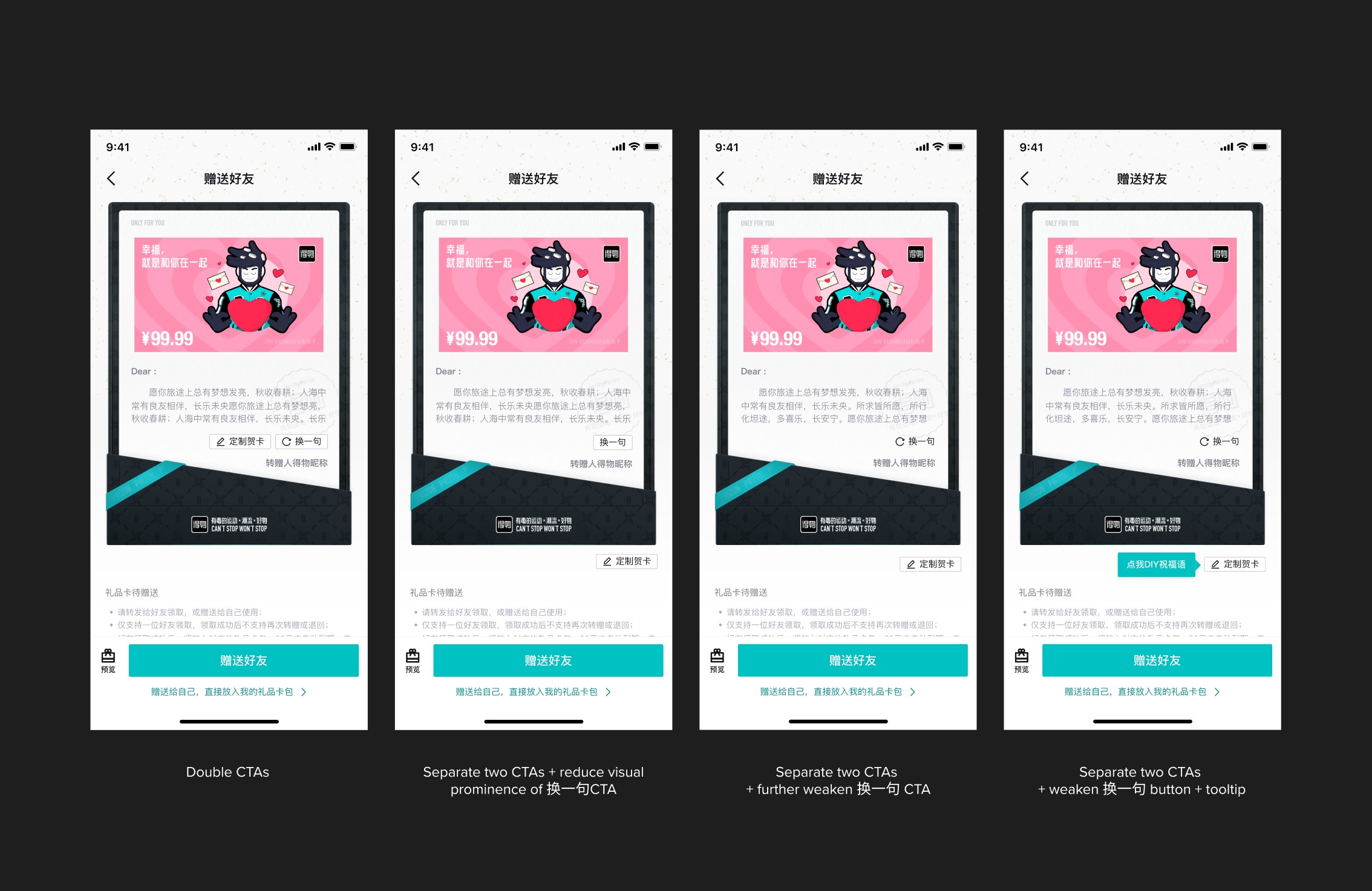
Exploring CTA Layouts and Visual Prominence for Optimal User Attention
The challenge was to retain the current refresh button (换一句) while making the new feature's entry point sufficiently noticeable. I explored four options to achieve this:
Double CTAs: Places two buttons in a single line feels crowded and doesn’t highlight the new feature
Separate two CTAs: Creates a cleaner look, but it still doesn’t efficiently highlight the new feature
Further weaken 换一句 CTA: Improves cleanliness, but lacks sufficient visual contrast to draw attention to the new feature.
Add a tooltip: Using a tooltip effectively increases the visual prominence of the new feature.
Notes customization
Choosing the Right UI Pattern: Why Bottom Sheet Wins
Multi-step flow
Pros: Flexibility
Cons: High dev effort
Modal
Pros: Low dev effort
Cons: Limited real estate
Bottom sheet
Moderate dev effort
Flexibility
In Comparision:
User’s Attention: Alert > Popover > Pages
Information Content: Pages> Popover >Alert
Interruptibility of current tasks:Pages> Popover >Alert
Flexibility: Pages> Popover >Alert
Overall: The bottom sheet is the most suitable choice.
Multi-step flow
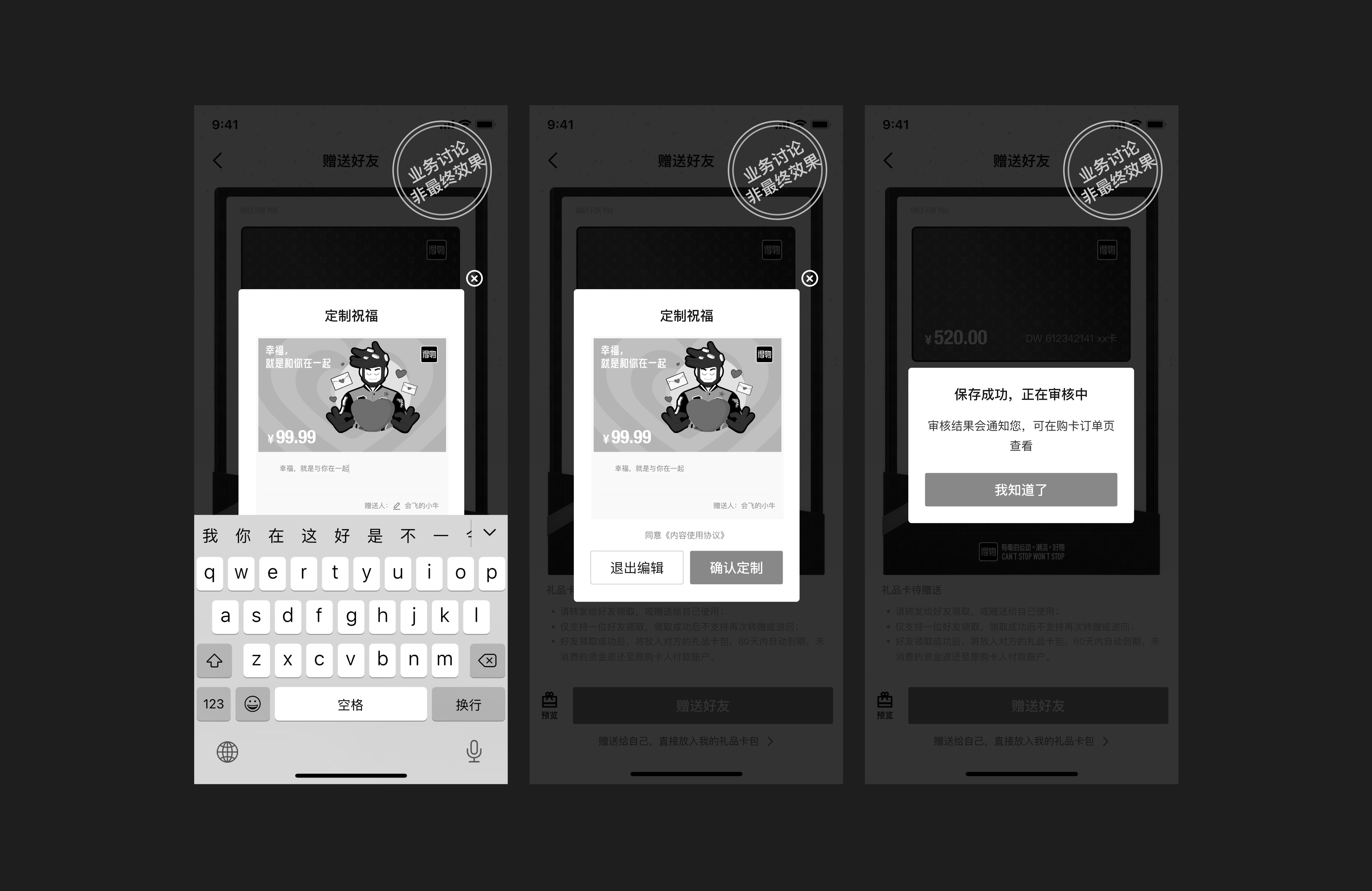
Modal
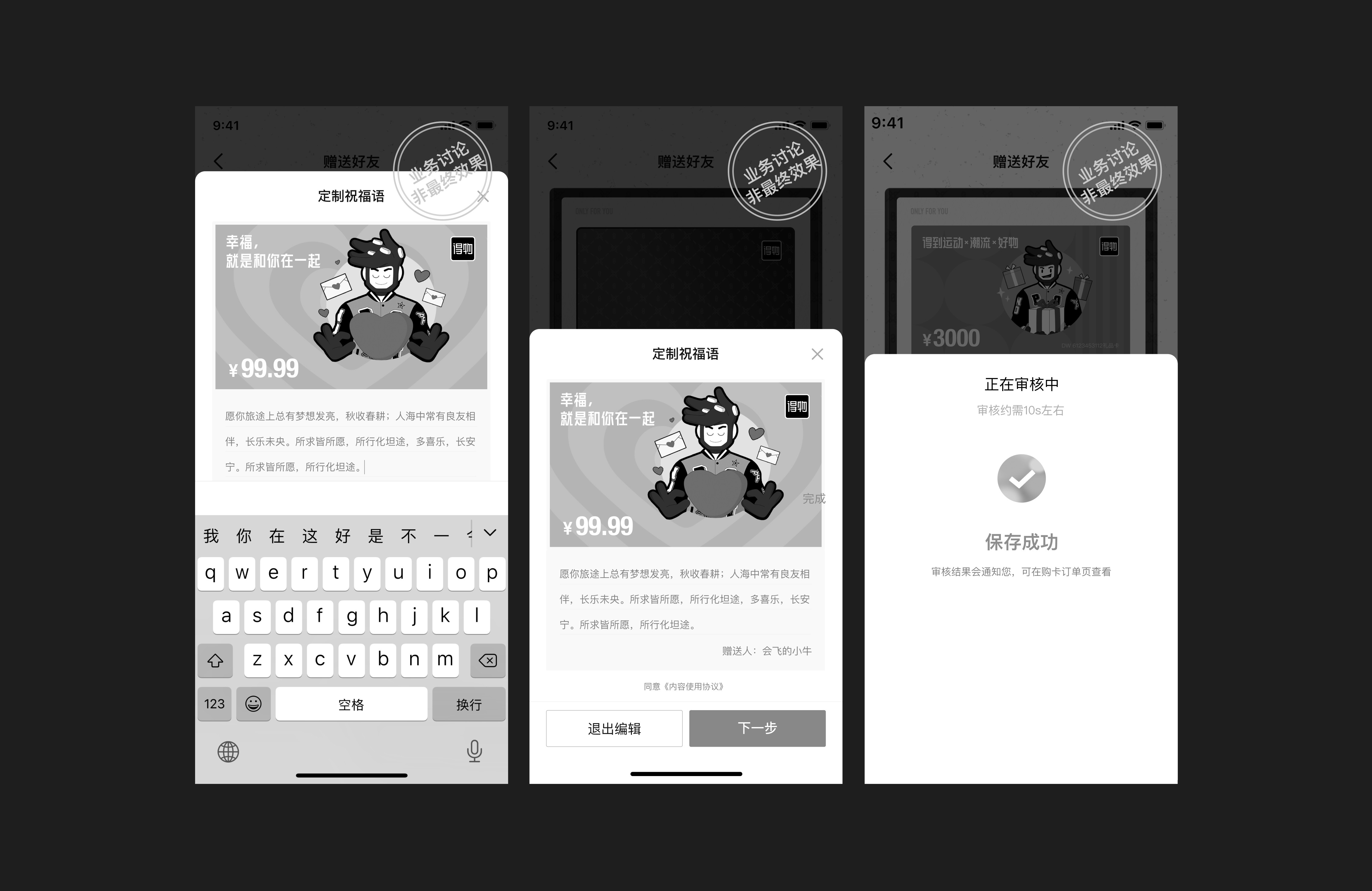
Bottom Sheet
[04] Hi-Fi Delivery
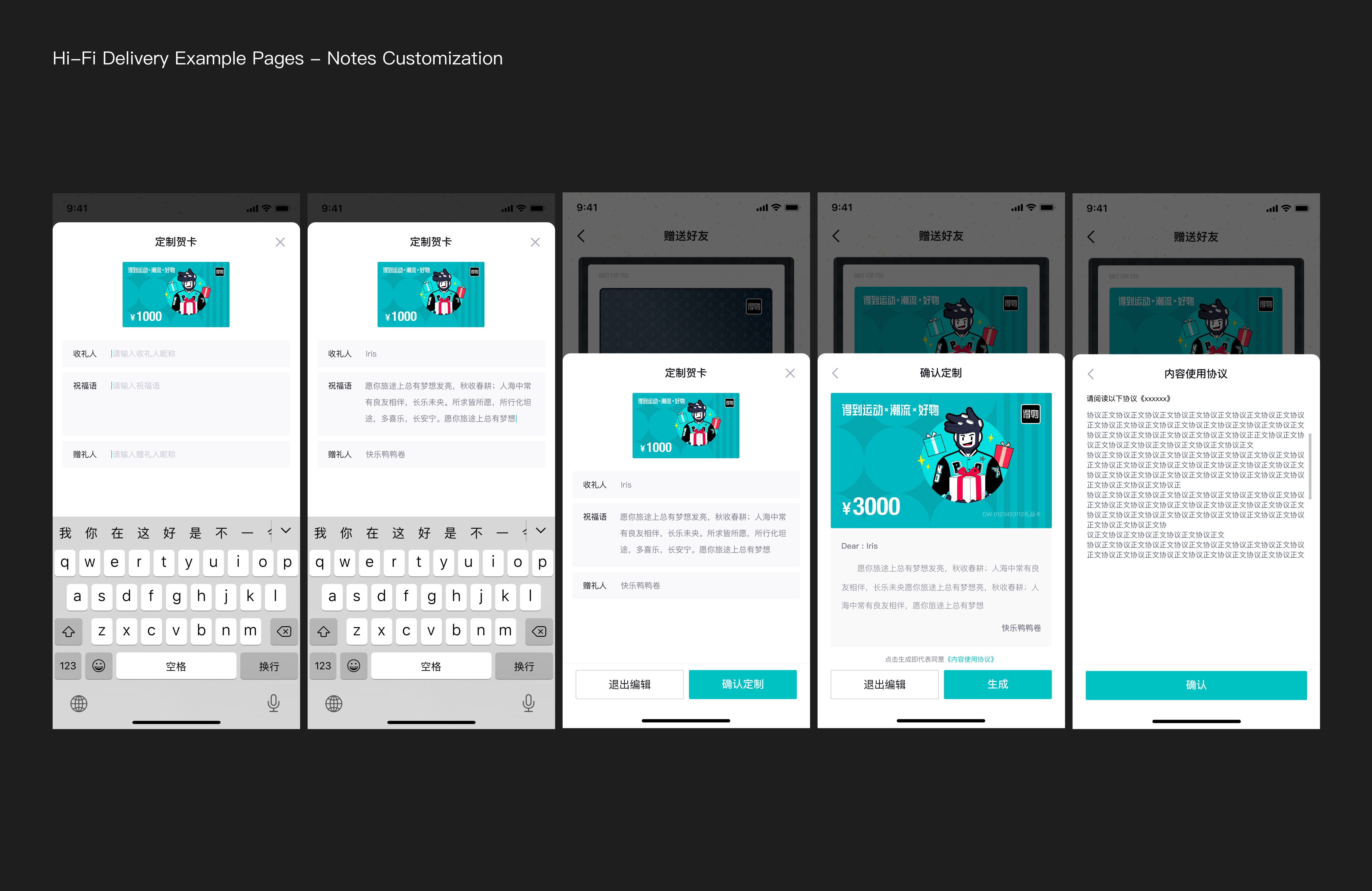
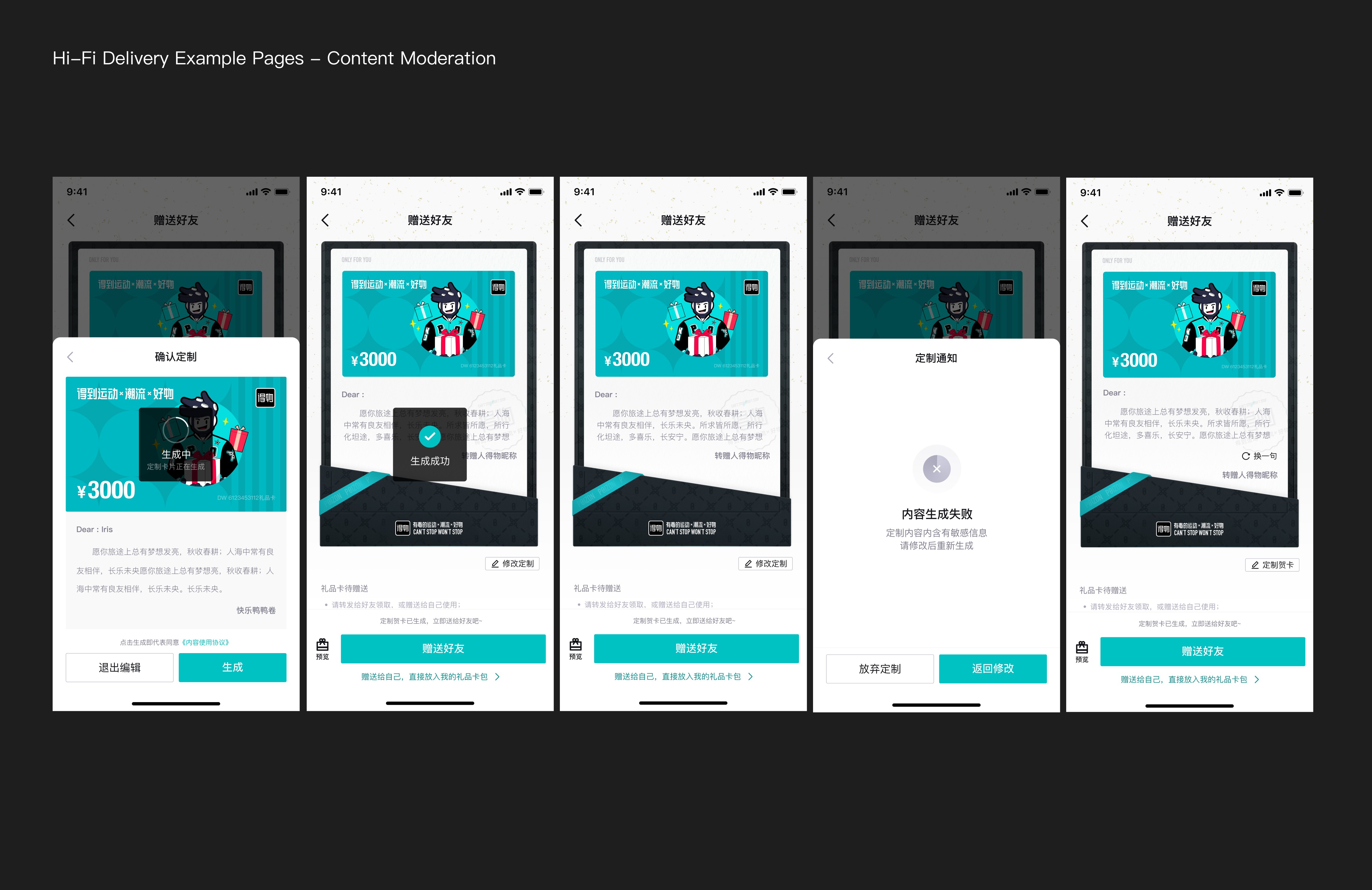
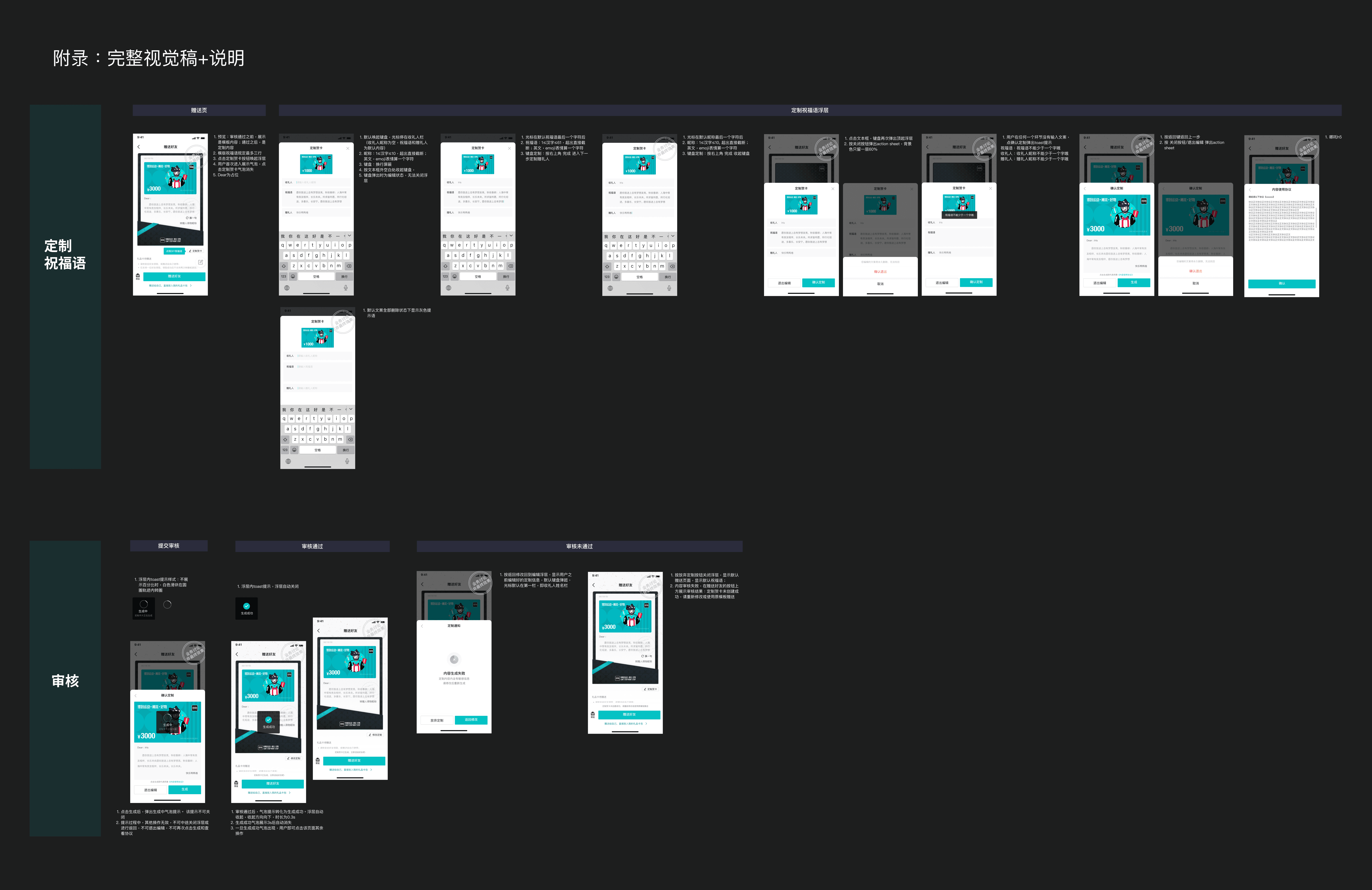
All Hi-Fi Delivery Handoff
[04] Putting things in Production
Design handoff
Build design specs
Work with Eng to ensure design quality
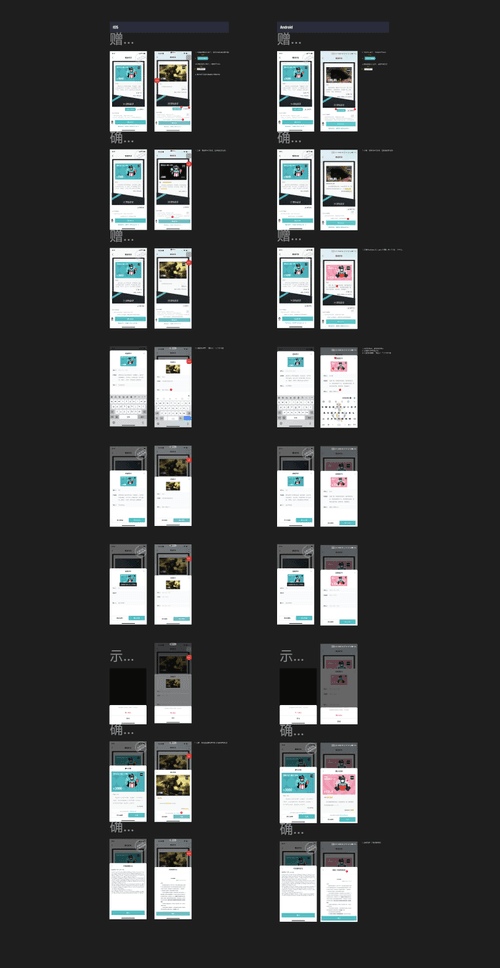
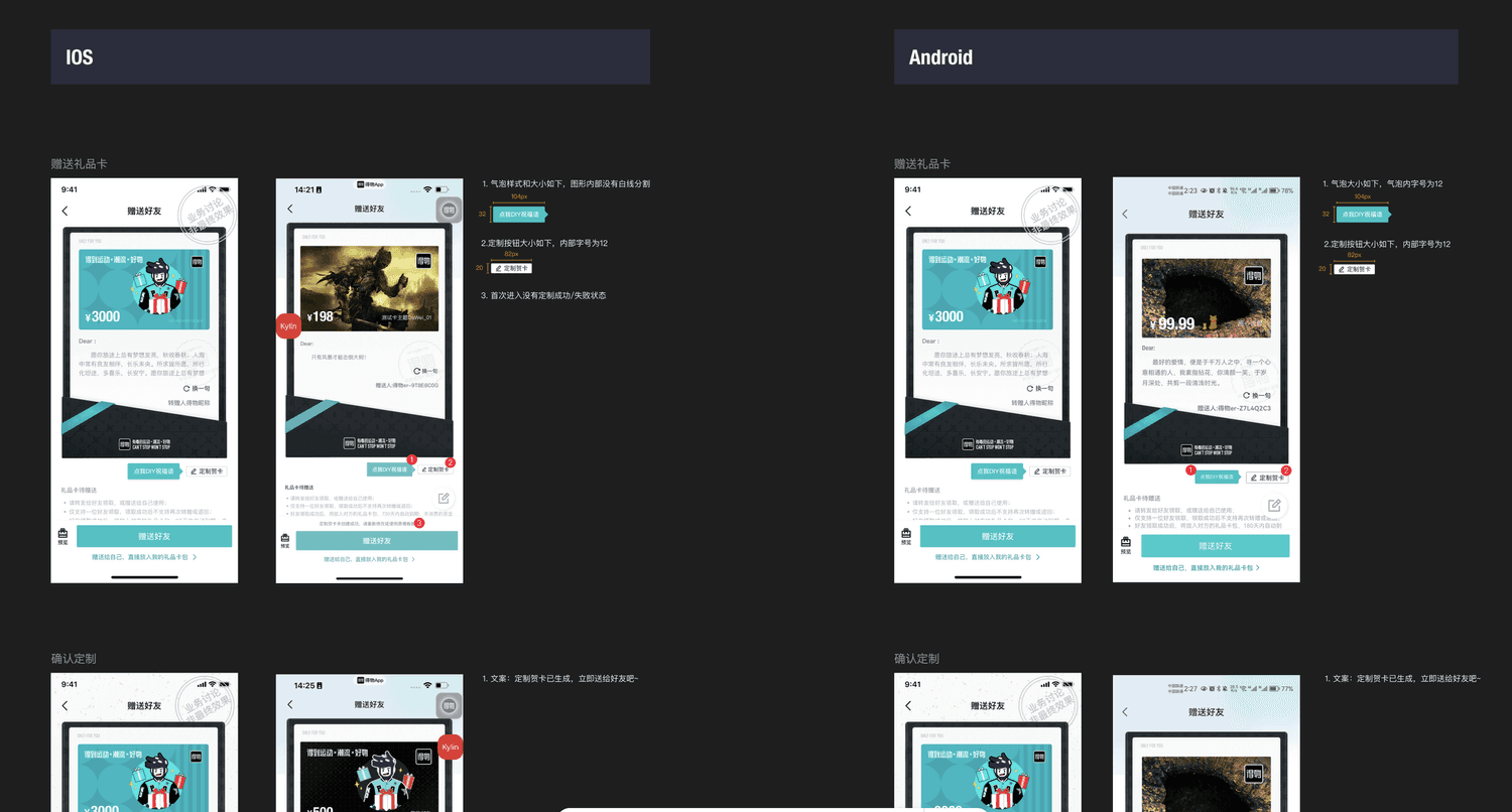
Launched successfully on time
11.5+% increase in gift card purchase
Be brave, be strategic
There was a challenging situation where the PM requested major changes to the PRD right after our low-fidelity presentation on a Friday evening—an unusual time for such changes, as we were set to begin hi-fI designs the following week. Unsure how to respond, I was fortunate to have a supportive mentor who helped me push back professionally, and we successfully avoided unnecessary extra work while still delivering the feature. This experience taught me the importance of standing my ground, and that being an intern doesn’t mean accepting unreasonable demands.
Take initivate
Since it was my first internship as a UX designer, even though I completed most tasks well, I tended to wait for others to assign work to me. In meetings, I mostly listened because I wasn’t sure what to say or how to contribute. If I had the chance to do it again, I would definitely take more initiative and ask more product-related questions to better understand the bigger picture and contribute more proactively.
Focus more on the metrics
At the time, I wasn’t familiar with product metrics, so I didn’t pay much attention to them—I assumed they weren’t that important for an intern. Looking back, if I had the chance to do it again, I would definitely dive deeper into the metrics, because I now understand how essential they are in guiding design decisions and measuring impact.