SeeM
AI Driven Online Exhibition
SeeM is a startup making art education accessible through a web app that creates AI-curated exhibitions based on user interests or custom text prompts.

SeeM - AI Driven Online Exhibition
0->1 Web App Design
[Overview]
At SeeM, I led the end-to-end design of three core features for the web app’s MVP: daily exhibition and artwork recommendations, a general search function, and the exhibition generator.
[Highlights]
Lead design ideation & solutioning:
Led the design from concepts to high-fi prototype, ensuring alignment with business goals and technical feasibility before MVP rollout.
Cross-functional collaboration:
Increased design efficiency by 42% by creating a scalable design system together with lead designers, reducing inconsistencies and streamlining design handoff.
Improved usability by working with the cross-function team to conduct user tests, reducing friction by approximately 26%.
[Problem Framing]
Problem Statement
Local and university museums face declining attendance and financial losses, while educational institutions and underprivileged individuals report a lack of engagement and access to quality art

Alex Johnson
Freelance Graphic Designer
I want to expand my knowledge of art but find it challenging to know where to start.
Age: 29
Location: New York City
Tech Proficiency: Moderate
Gender: Male
[Goal]
Exploring various art forms and historical contexts
Learn more about art without feeling overwhelmed
Connect artistic concepts with own design work
[Frustrations]
Struggle to understand artworks
Takes too long to find interesting artworks
Overwhelmed by information or cluttered layout
⭕ Ambiguity in Product Requirements Document
The product’s nature—website or web app—was unclear at the start.
Only key features were defined, leaving room for interpretation.
✅ Refine the Product Requirements Document (PRD).
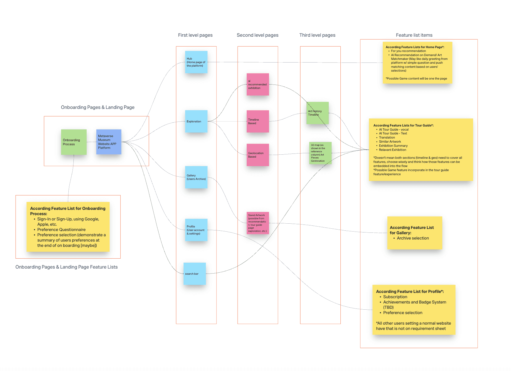
To address the ambiguity in the product requirements, I collaborate with lead designers to refine the Product Requirements Document (PRD) and mapped out the site architecture of the webapp:
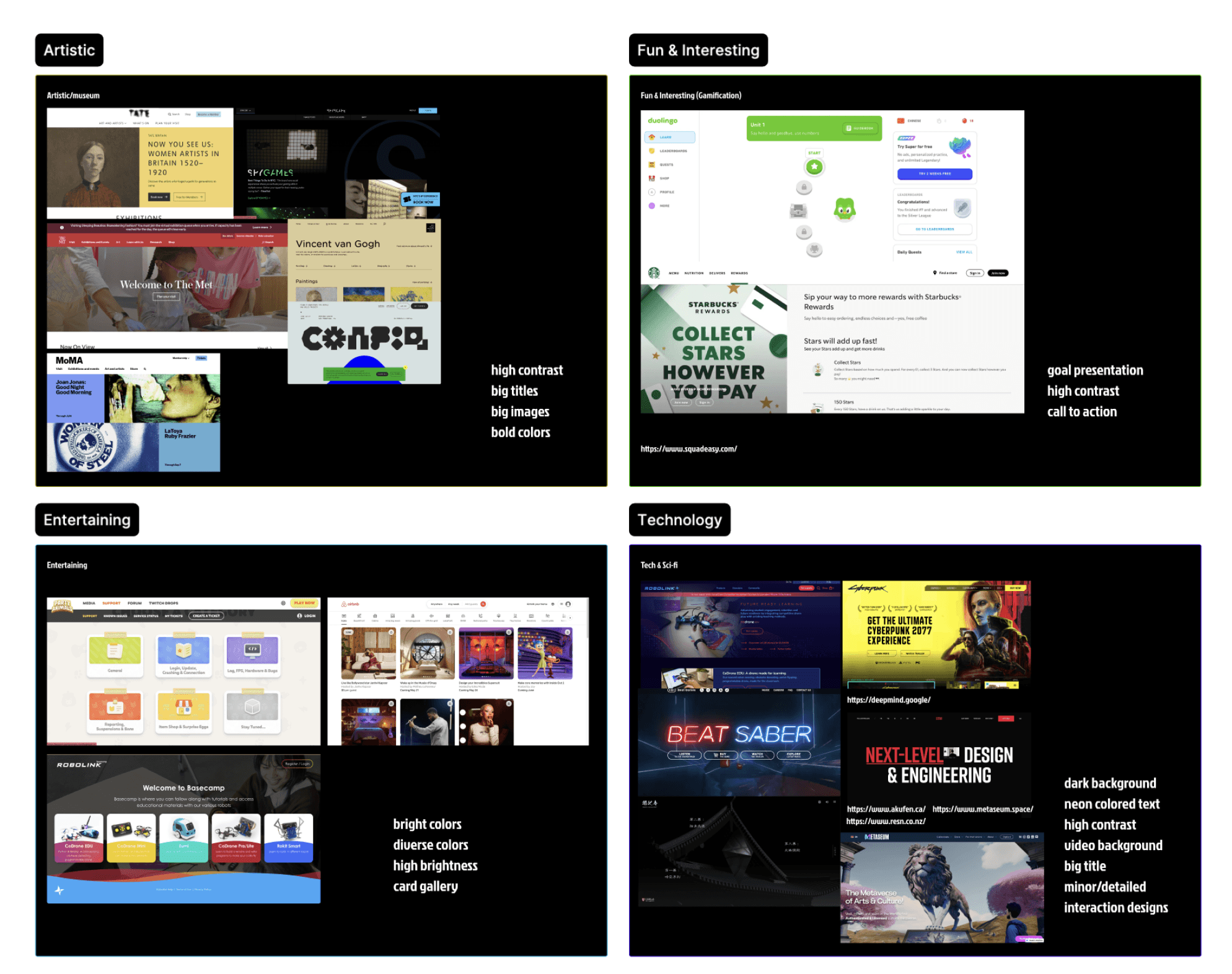
🧠 Establishing a Cohesive Visual Direction
Began by researching best practices to define a mood board that aligns with the product vision.
Identified two common types of web services: web apps and websites.
✅ Propose early concepts as conversation starter
Designed Home and Search page wireframes for both web app and website formats, comparing interaction flows and content hierarchy.

✅ Brought clarity to the product strategy.
Collaborated with the PM to refine the Product Requirements Document (PRD) for clearer direction.
[02] Refine key features
✅ Took ownership of three pivotal pages: Home, Search, and AI Curation.
Early concepts informed high-level directions, but they also revealed many challenges and complexities.
✅ Conducting user testing for early concepts
Ran online user testing with an interactive Figma prototype.
Synthesized user feedback with the design team to refine concepts.

Home Page
⭕ Website: Poor navigation
Unclear CTAs, interactions, and button states caused navigation confusion.
The landing page lacked emphasis on AI-generated exhibitions.

⭕ Web app: High dev effort
Resizing artworks for new exhibitions posed challenges.
Heavy information density on artworks page leading to cognitive fatigue and reduced engagement.
Product team prioritizes showcasing exhibitions over individual artworks.

✅ Iterations: Clear and scalable navigation
A web app is a more suitable option to support the full functionality of the product.
Clarified three main tabs to highlight key functions: Curated Exhibition, Art Piece, and Exhibition Generation.
Made CTAs more explicit (e.g., clarifying “Learn More” vs. “Enter Exhibition”).

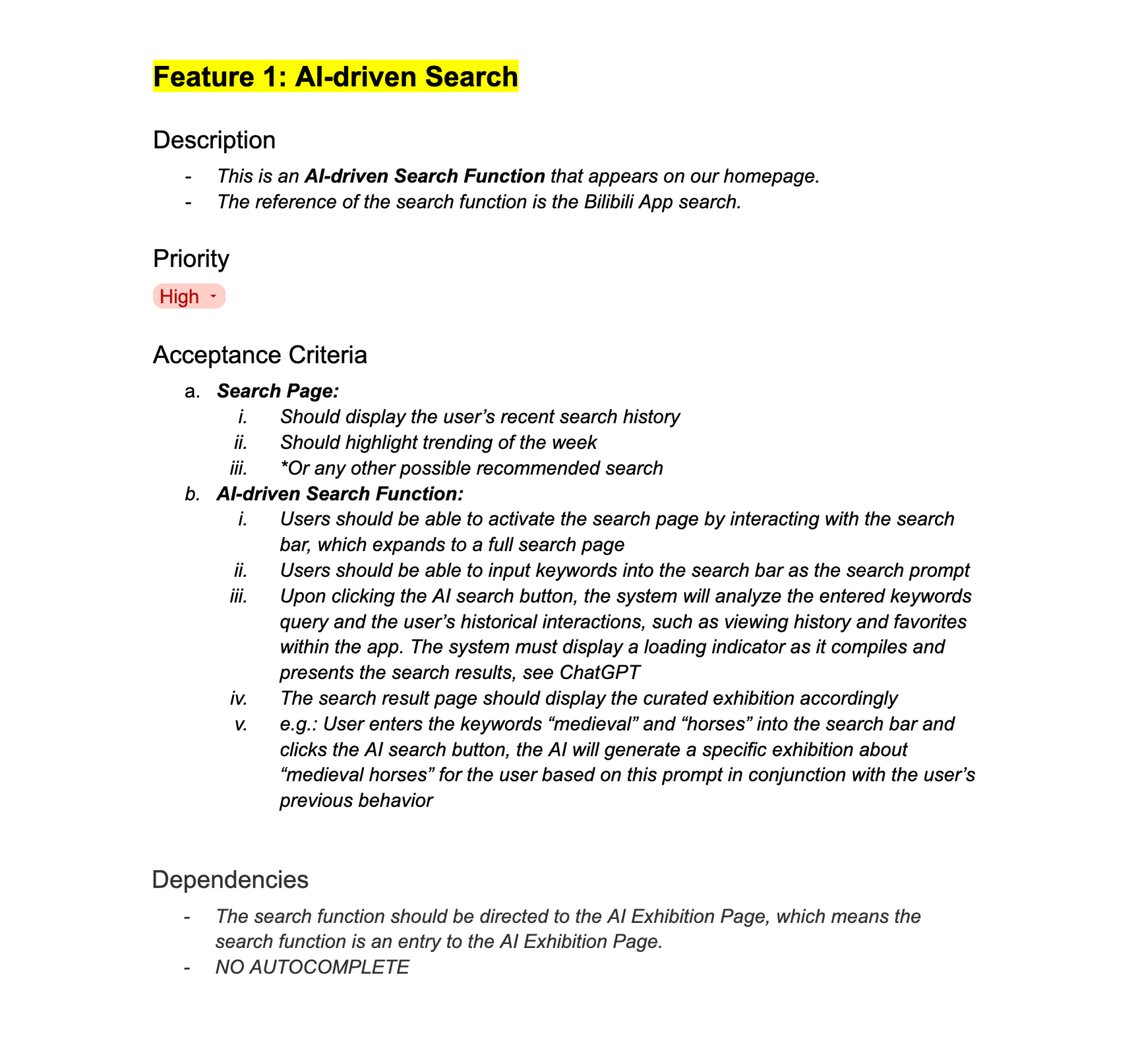
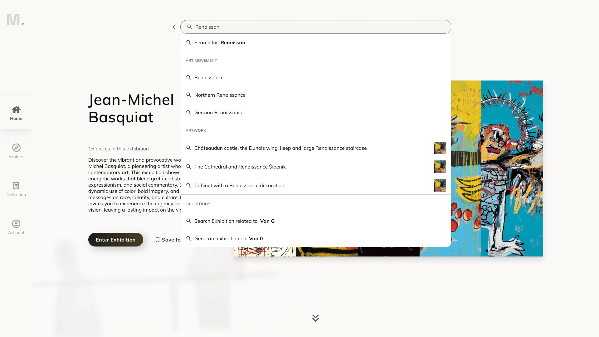
Search Page
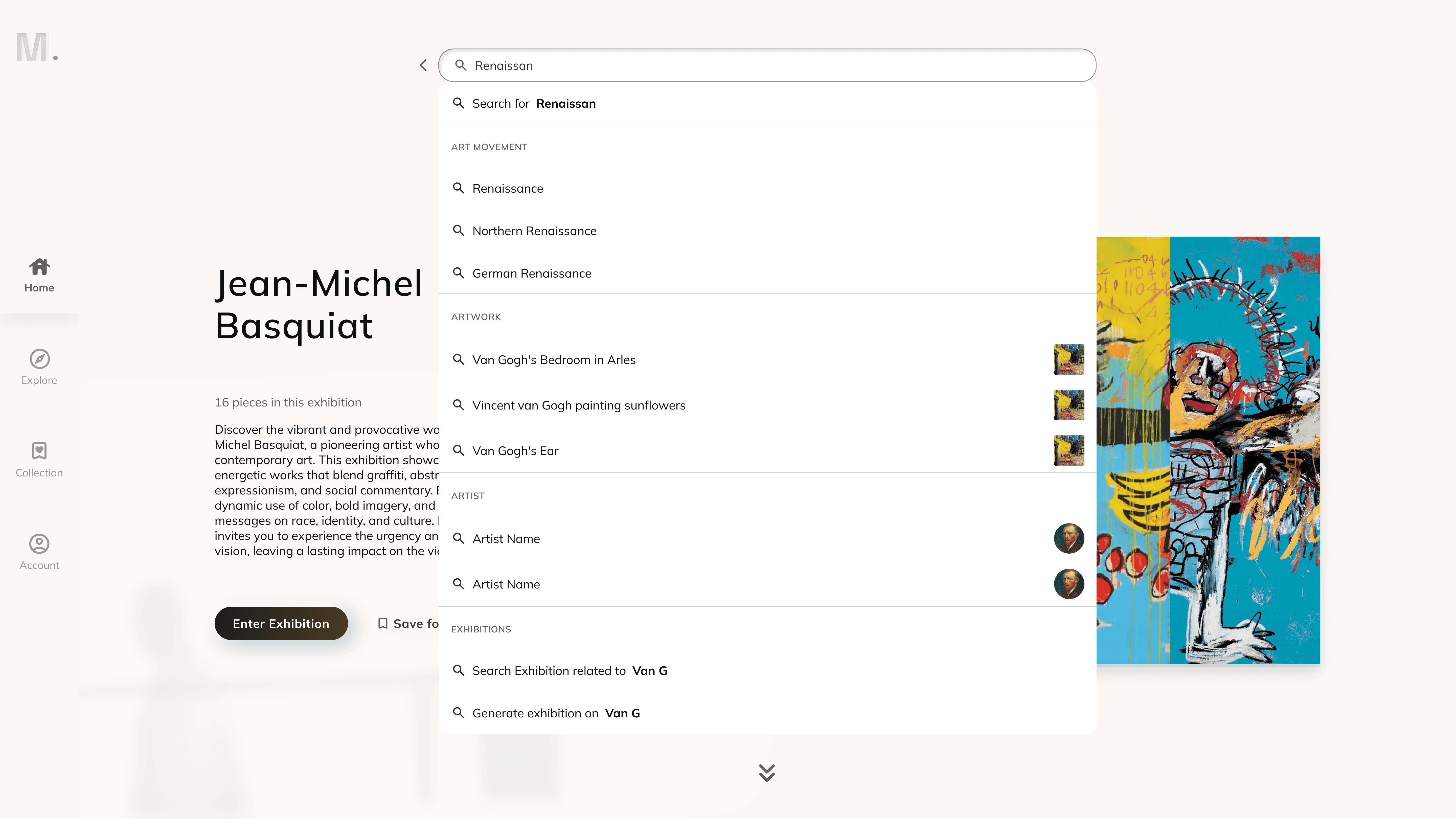
⭕ Confusion between generic search and AI-driven search functions
Users were confused by the current AI-driven search function, as they expected it to operate like a generic search function.

✅ Iterations: Two Distinct Entry Points
I proposed to the product manager that we implement two types of search functions: a generic search and an AI-driven search. The latter generates exhibitions based on user input using AI.
Additionally, the layout of the search page needs to be rethought. I propose separating the AI generation feature from the generic search function to minimize user confusion and clearly differentiate between the two functionalities.
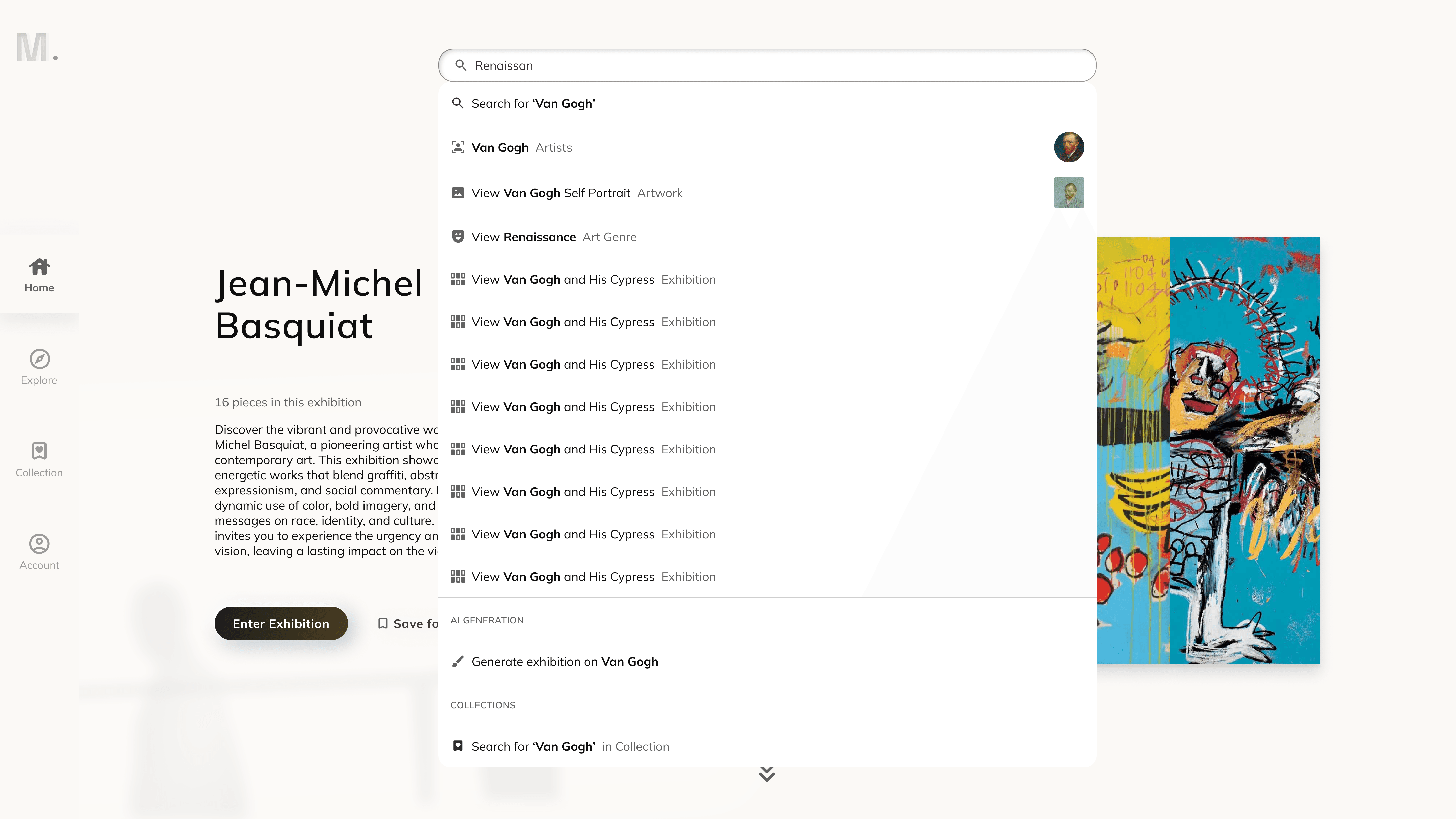
🤔 How to help users easily discover contents through generic search?
Our site features diverse content—curated exhibitions, artworks, artists, and art movements—making it potentially difficult for users to search what they need efficiently.
🧠 Categorize existing content and research best practices
Define what materials users can access on our platform.
Researched best practices to structure and categorize contents for better discoverability.
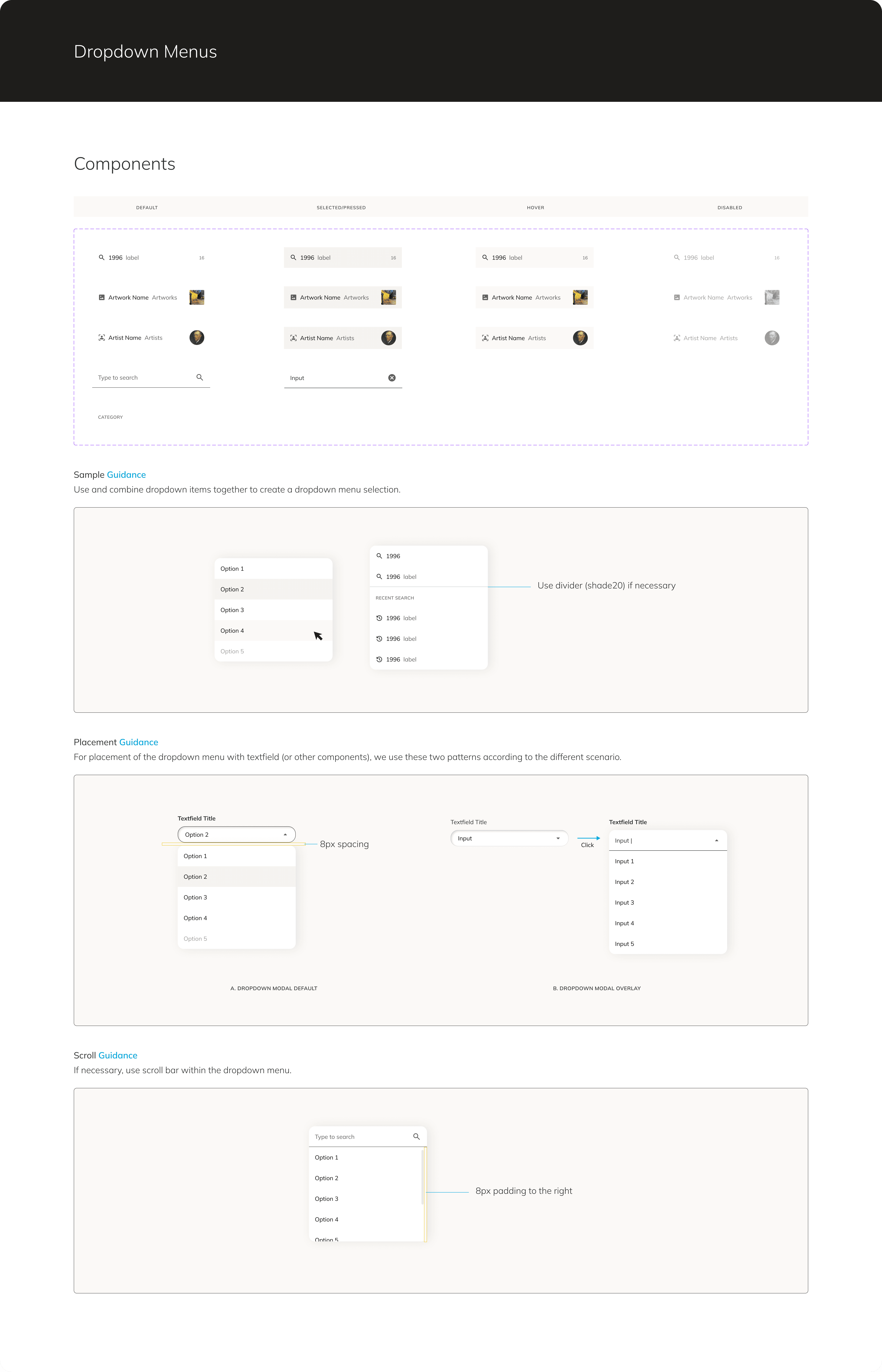
Google Arts enhances its dropdown menu with icons, making it easier for users to identify various content categories.
Slack’s dropdown interface incorporates multiple tabs, allowing users to easily switch between different content types.

✅ Propose differnet solutions and get buy-ins
Proposed multiple design solutions to improve filtering for generic search results.
The final design shows clear pathways to relevant content, which enhances user experience by making navigation clearer and reducing any potential confusion between categories.

[03] A fully comprehensive design deliverable
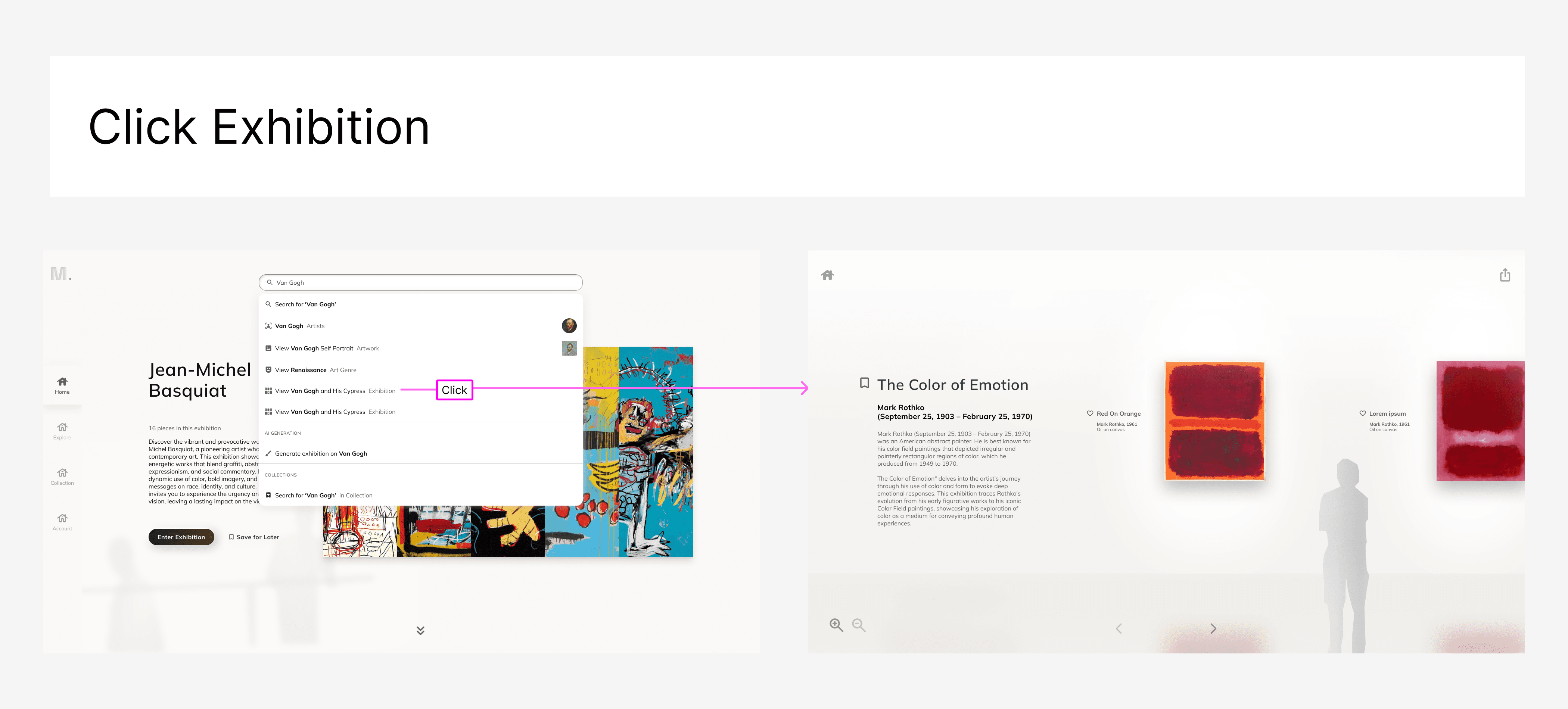
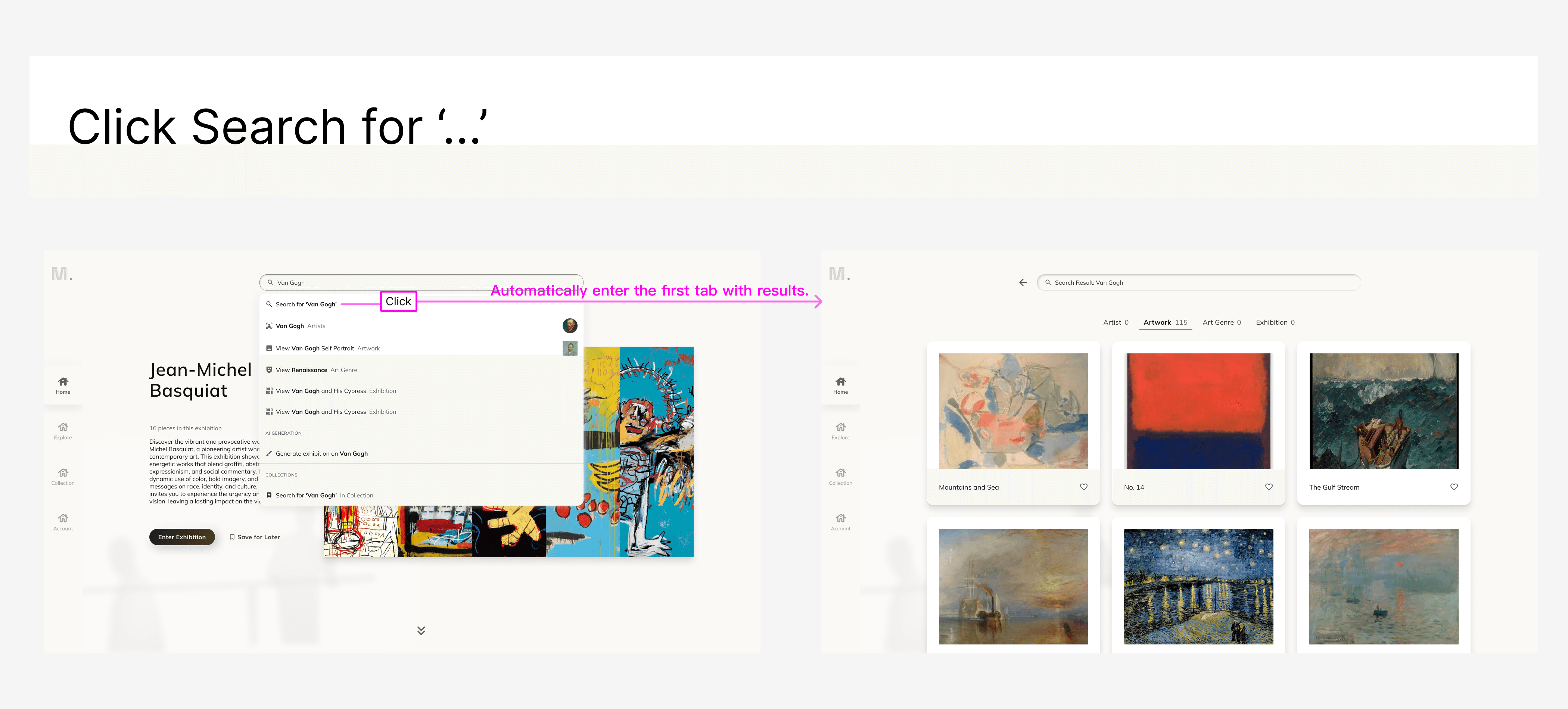
✅ Prototyped key interactions to enhance clarity and alignment
Designed simple animations and interactive prototypes to keep users engaged while exhibitions are being generated.
✅ Clear design deliverable for engineering handoff
Created detailed user flows to guide development and ensure seamless user interactions. See below examples:
✅ Consistent Visual Language & Reusable Components
Collaborated with lead designers to build a design system, ensuring visual consistency in the web app.

[Outcome]
MVP Key features rollout.
26% reduction in user friction after design iterations.
Increased design efficiency by 42% by creating a design system.
[Key Learnings]